
The way they talk about it makes it sound like they invented the written word, but that notwithstanding the fonts actually look really nice in my opinion.
People actually change fonts in their IDE? I’ve always used whatever the default is and never even thought about it.
Try Fira Code font
I’m a big fan of Fira Code! I haven’t found any others I like more.
Love Fira Code but recently switched to https://typeof.net/Iosevka/ and it’s equally great.
I actually have. I didn’t install it in an IDE, though. This font comes with popOS
I always do. I’m a fan of JetBrains Mono.
It is the default font. At least in all the JetBrains IDE
I’m an Envy Code R fan myself.
some people even change default system fonts used in the deskop environment (menu’s, filemanager etc) 😎😁
Damn, I need to get out more.
Actually you have to stay in more to get into this sort of thing.
I’ve always preferred IBM’s Plex Mono, specifically the Nerd Fonts version.
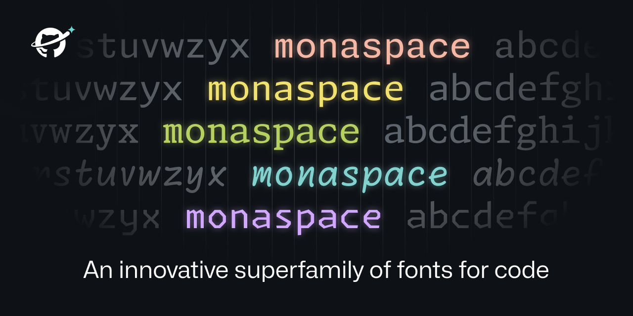
Oh man fonts for coding are such a huge thing. There are people making their own forks of so they have certain glyphs, or a line through the zero (or vice versa) or little changes to other specific chars.
I can’t stand Jetbrains default font. The height of the letters is too large
Calling it now, Radon will become the new Comic Sans.
Honestly I could see radon for comments only. It makes it clear that it’s a comment by the font alone.
Except I like reading the comments…
I can too. I’ve seen something like that before. It was interesting, but not interesting enough for me to care about it as a feature.
Yeah, I looked at the first couple of fonts, then read all that stuff about readability this, state of the art that, expressive palettes la-di-da and I thought “ok maybe they have an idea here”.
Then I looked at the rest of the examples and ran into that… thing. Like, the fucker’s so aggressively irritating to read that you could use that font to hide eg. backdoors in code, and reviewers would instinctively skip over those parts just to avoid the pain.
I mean, Comic Code is pretty damn good.
I can’t believe how no one seems to have mentioned how beautifully made this website is though. Absolute pleasure to scroll through on mobile.
That was interesting how they adjusted sizes based on adjacent letters. Good idea
Great idea but the name texture healing is terrible. It’s not healing anything and there are no textures with fonts. Dynamic or flexible weight makes a lot more sense.
I agree that texture healing is a bit too vague about that they’re really using it for. Its really for kerning pair without disrupting the monospaced grid. Maybe, since the audience for these fonts aren’t usually typographers, they should have called it Monospaced Kerning Pairs?
Texture is a term and feature of typefaces in design however. Usually described for fonts used in body text, or larger blocks of text.
While it probably doesn’t affect shorter lines of text used in most coding languages, it can be harder to read when smaller sizes are used. Monospaced MmWw are the worst culprits.
One memorable observation on typographic texture was made by Heinz Peyer, a Swiss poet, who said that reading a text composed in Helvetica was like walking through a field of stones, whereas reading a text in Syntax was like walking through a field of flowers. (23)
Form is often susceptible to logical analysis, and pattern somewhat so, but texture evades precise description because its repetitions are so numerous, its features so small, and its interactions so refined, that the multifarious complexity of the emergent image resists orderly analysis. Texture requires a holistic more than an analytic under standing.
Ironically the second paragraph is turning out to be largely incorrect with smarter ways to analyze blocks of typeface texture. Also this second paragraph nicely illustrates the utter wankery present in a lot of typography circles and analysis.
Gotta justify that grad school bill somehow (pun intended).
Edited for spelling
Oh interesting! In that vain, it does make sense. Thanks for taking the time to explain that.
Getting major Marvin Gaye vibes.
When I get to squinting, I want… textural healing
Like kerning pairs, but with character swapping instead of kerning adjustments. It’s a really clever use of the language features available in Unicode.
Too bad I’m married to JetBrains Mono.
Does anyone know if Jetbrains Mono also does the whole dynamic width thing?
Could elaborate on what the “dynamic width thing” means?
The text healing that is mentioned in the link
Like how Neo flexes in the hallway and the entire Matrix flexes around him, except with wide letters like ‘m’.
Letters like m and I are still same pixel width, you just use function of openfonts to shift letters and replace with wider version where possible.
#[ i ][ w ]
Becomes
#[ i ][\/\/]
Don’t think it does.
I broke up with JB Mono a while ago :'(
I like Hack as my font of choice, but I will probably give this a shot. It’s a font, there is no risk of data collection, Microsoft style bugs, or other Microsoft-associated product issues.
I used Dejavu Sans for like 10 years, and Hack is the perfect incremental improvement. I’ve tried to use other fonts but I keep coming back to Hack.
https://security.stackexchange.com/questions/91347/how-can-a-font-be-used-for-privilege-escalation
Not a serious rebuttal. But yes, MS has found a way for Windows to be vulnerable to attacks using fonts.
What the…
I meant to link the CVE sorry. https://cve.mitre.org/cgi-bin/cvename.cgi?name=CVE-2011-3402
sorry i already have comic shanns for that
Thanks I hate it
I’ve used a similar comic-mono font for a while and it was really good! I don’t like how lots of mono typefaces are angular or sharp.
That doesn’t look half bad, actually!
i use it in visual studio code and it looks really nice!
Oh I’m gonna have to give that a try, thanks!
They really look nice. A good font makes a huge difference.
I’d never bother changing whatever default font the editor comes with and I don’t understand why anyone would care to
Some people care more about having fancy tools than actually doing work with them.
On reddit, I used to subscribe to the VS Code subreddit. A lot of posts were just about themes, people asking “what theme is this” or posting their latest minor recolor. Meanwhile, I’m there for posts about actually using the damn thing.
You are correct, but I find dialing an easy-on-the-eyes colour and a good font reduces eye strain. It lets me keep the font size small with less fatigue especially as my eyes (and I) age.
As for what theme? Usually it’s as simple as browsing through the presets until one jumps out. Takes a few seconds. Having more presets adds about 2 seconds to the process and often (not always!) results in an even better choice. Have no idea the name of the theme I end up with.
Besides, tweaking this can be fun if you’re between thoughts - you end up learning the inner workings of the environment.
Looks lovely! The art of fonts is something I will never understand but always appreciate. This website is also brilliant in showing everything dynamically and explaining why it all matters. Safe to say Github will start using it everywhere? It’s also open source, which is nice (and makes sense considering what Github is striving for).
Edit: Not 100% sure on texture healing though. Toggling it on and off in the example makes me feel like texture healing makes everything look weirder. It makes the font look less monospace which should be good, but it just messes with my mind when some letters look slightly different in different contexts. Like the spacing is not immediately obvious to me and having the same letters look different is throwing my mind in a loop. I guess I’ll need to try it to see if it’s comfortable.
deleted by creator
Very interesting technique to get the widths of the glyphs uniform without them looking ugly in most cases. OK, one can make it look bad if you know the “pain points” of the system, but in normal flowing texts, the fonts do look good.
Having different font styles depending on the context is a really nice feature. I’ll definitely give it a try.
It’s a cool idea and the example they gave actually seemed pretty neat.
I’d (somewhat perversely) love to see this feature tried in a terminal emulator. ANSI does actually define escape codes for switching to alternative fonts (ESC [ 10 m through ESC [ 19 m) though I don’t know of any software or even term drawing library that uses it.
That would really be neat.
Kitty terminal has a lot of configurations for fonts. I beleive you can get down to adjustments for specific charecters. Idk if it uses the specific technology you are suggesting. But it is explained in the kitty.conf docs.
A lot of code editors support that without the weird “healing” features they laid out here.
VSCode has pretty decent semantic based formatting options.
I didn’t think I had strong opinions on fonts.
Turns out I viscerally despise “handwriting” fonts. They’re harder to read. It just makes me recoil.
I also intensely dislike "ligatures " that turn like
==into a separate glyph. Or the one that turns=into the > with the line under it. No. Stop. That’s not what I typed. That’s not what I’m looking for when I scan the text.Side note: I assume someone is feeling clever and is thinking of replying with a handwriting font message with ligatures. You don’t have to. I already imagined it.
The texture healing seems cool though, but I didn’t immediately notice or understand until I read through the detailed section on it.
That Krypton font do looking nice
Yeah, like, since when does Microsoft put out something both functional and cool, ya know?
Like Age of Empires?
Well, their previous fonts are nice, Calibri etc
I’m a simple man, I just use DejaVu Sans Mono without any ligatures or other fancy stuff.
Works everywhere.
Will they replace Consolas in Windows with this one or is it a GitHub-only-thing? In Consolas the characters
1andllook very similar, making the font unsuitable for coding and terminal use, so it would be good if they replaced it with something else.Anyone who makes a font where
Iland|are not immediately distinguishable should be barred from working in the industry.I hate Arial as much as a person could possibly hate a font for this exact reason.
Unfortunately this new font family still struggles with the l1 issue,in all but the last two typefaces. There’s a lot of good ideas here, and the Krypton version isn’t too bad, but I still struggle to see why they haven’t figured out that gaping issue on most of the styles here.