

userscript called “old.reddit” found here: https://github.com/soundjester/lemmy_monkey
-
(recently updated for Lemmy v0.18)
-
This is primarily for desktop clients. At the moment, formatting get a little crazy below 1280 px wide. There are ways to address this, but I have not at this time.
-
script will be updated as suggested
- significant changes have been made to address alignment, spacing, and other format issues. v1.1 will be where I stop for a while.
-
there are two script versions: old.reddit and old.reddit.compact. The primary difference is that the “compact” version greatly reduces thumbnail size and padding space.
-
notice: current script unblurs NSFW
(linked thumbnail shows old.reddit.compact version of the script)
Screenshot of old.reddit script results:
Oh my gosh this is amazing. Thank you for this.
If you are using greasemonkey, I suggest appending
to the end of the github raw url and then reloading the page, this should allow the css to be installed by greasemonkey and automatically updated.Ooh, pro tip! I’ll do that
If you are changing the actual file name in the github repo remove the “#”
So
https://raw.githubusercontent.com/soundjester/lemmy_monkey/main/old.reddit.compact.js
Would become
https://raw.githubusercontent.com/soundjester/lemmy_monkey/main/old.reddit.compact.user.js
The # is just to append it in the url bar to allow auto installing in greasemonkey. I’m not sure if it’s the same in tampermonkey though.
Yup, got it. Thanks for the pointer!
I don’t want to pat myself on the back TOO hard, but I just browsed through 44 pages of content and it was SO NICE and easy on the eyes.
Nah man you can pat yourself. My 4k resolution is finally utilized and I am very happy with how almost everything looks.
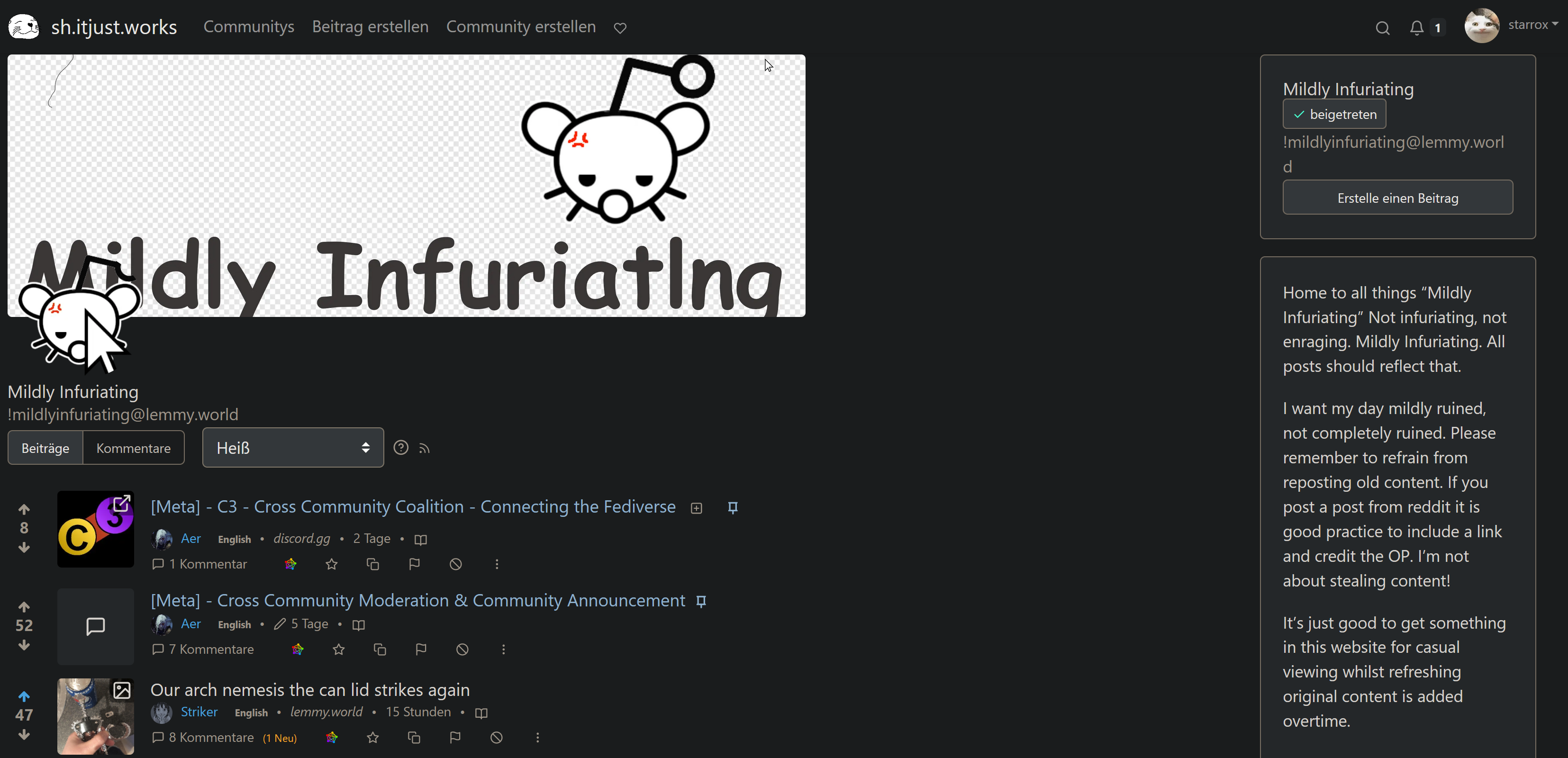
Some community headers get scaled pretty wonky, for example in https://sh.itjust.works/c/mildlyinfuriating@lemmy.world but thats a small price to pay for more visual clarity overall.
Thank you for the great work!
I added a line to restrict the banner width to a lemmy-native 730px - this should keep banner images looking as intended… Check out the update and see if that fixes the issue. (link for good order: https://github.com/soundjester/lemmy_monkey)
Wow that was fast! Although I’m not 100% sure its better (for high-res at least).
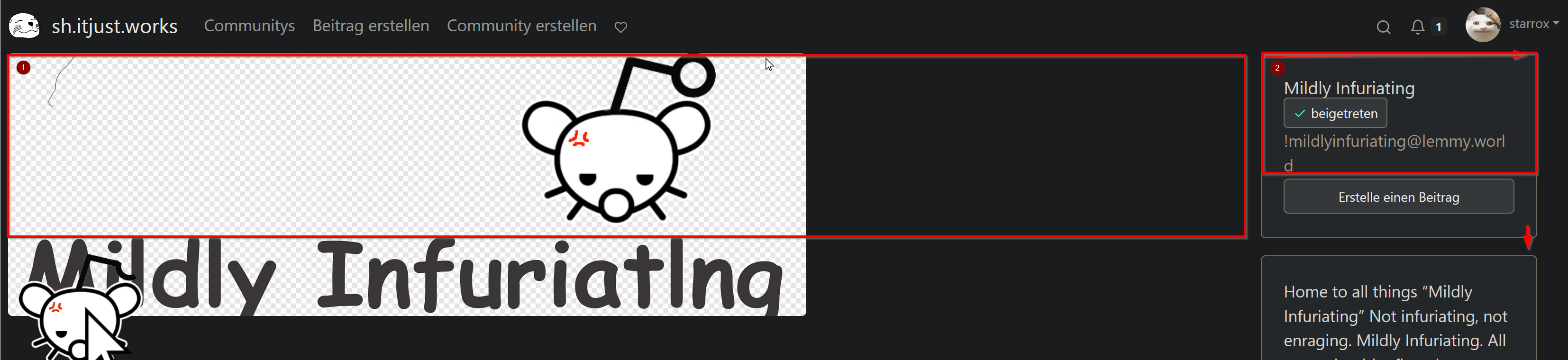
Here’s how it looks for me on a 3840x2160 resolution and 110% zoom:
But I think I understand the technical reasons beyond your change. It should be universally applicable and not just on 4k res.
I think it still would look best if the banner is spanning the whole top, maybe up to the community-sidebar on the right (1) or even beyond that (2). I tried to highlight 1 & 2 in this poor greenshot cap :)
Anyway, thanks for your great work!!
I think having a slim banner is better, because it takes away less precious space on smaller screens. Remember that not everyone has huge monitors, many use web browsers on laptops and the like.
I absolutely agree that a wider, somewhat shorter banner across the top would be best. My current logic is that most mods do not have this userscript and rely on the limits set by the default stylesheet. So they upload images optimized to fill a 730 x 240 space.
The line that controls this in the script is line 75:
GM_addStyle(".position-relative.mb-2 { max-width: 730px; }");if you take that out and replace it with:GM_addStyle(".img-fluid { height: 180px; }");you’ll have something closer to what you want. It’ll still look strange tho (IMO)^^ do not do this ^^ I was wrong
I’ve just tested it. the GM_addStyle(“.position-relative.mb-2 { max-width: 730px; }”); is definitive the way to for now. I think you are spot on with the banner size.
yeah. this also has the happy effect of “correctly” formatting profile banner pics as well…
Yes. I’ve also looked around a bit in different subs and many of them dont even have a banner wider than a few pixels. I guess thats as good as it gets as long as there are no specified banner sizes enforced all across the network. And of course not everyone uses your glorious script (but I’ll spread the word, its really really cool!).
The widescreen really makes a difference.
modded you
Nice, thanks. Not sure I’ll want to stay a mod if this picks up however :D
lol why not?
and leaving is ez, there’s a “leave mod team” button on the sidebar below the community name
I have way too many responsibilities as it is, can’t add another in good conscience, that’s all
alright, no problem :)
modded
thanks for formatting like this, good style reference.
hopefully it will help with searching in the future
Bro you got modded by fucking God himself :O
Awesome work! Would it be possible to add the “expand image/video/text” button from RES? Preferably with the option to increase/decrease the size of images by dragging with the mouse.
I’m talking about these: https://imgur.com/a/1yH5FTN
That would perfect my experience!
Here’s a userscript that auto-expands images: https://sh.itjust.works/post/164735 it’s nice because it keeps the scripts a little more single-purpose so that if one malfunctions, the other stays working. Incorporating all of the things would be perfect for a plug-in, which is being discussed.
it’s great!
out of curiosity, which version did you go for - the one with the larger thumbnails or the compact version?
Compact version! Liking it very much :)
i pinned a guide on how to install grease tamper etc here: https://sh.itjust.works/post/71088 maybe you can help augment it if you want. i’ll add violentmonkey link.
hopefully this removes the need of clarifying how to install userscripts any time we make an update or post.
This is amazing! I think everyone needs to install this. Thank you!
great! Have you consider packing this up as a full theme for Lemmy?
yeah, i keep trying to look at the bootstrap themes but it just isn’t super clear how I would edit it to be color agnostic. Like, hopefully this script works with whatever color theming you choose, it just changes the layout.
It looks really cool but the side margins are waaay too small for my taste. I tried putting some little 1rem margins back in the container css but that gave a bad bottom scrollbar (which is the most annoying on the communities list). It’s getting late and there is work tomorrow but I might look into it more later.
I believe I’ve remedied this issue, if you want to take another look at it. link to script here: https://github.com/soundjester/lemmy_monkey
nice job so far.
Communities page (both list and search) need some margins.
Issue (hopefully) resolved. v0.8 available on github: https://github.com/soundjester/lemmy_monkey/blob/main/old.reddit


![[userscript] (grease/violent/tamper) *monkey script to reformat Lemmy's look and feel to old.reddit with RES](https://i.imgur.com/RXo5aVT.png)