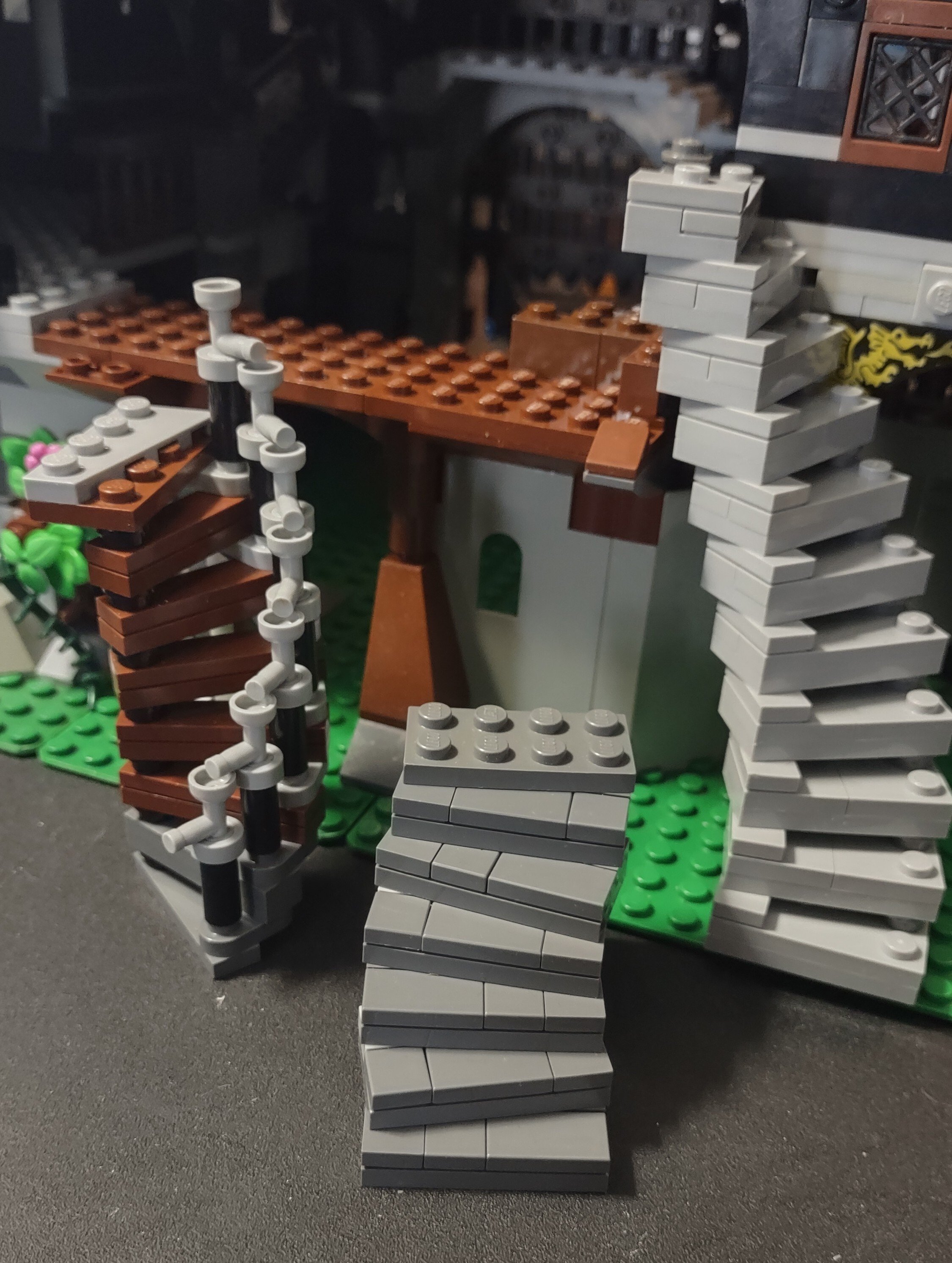
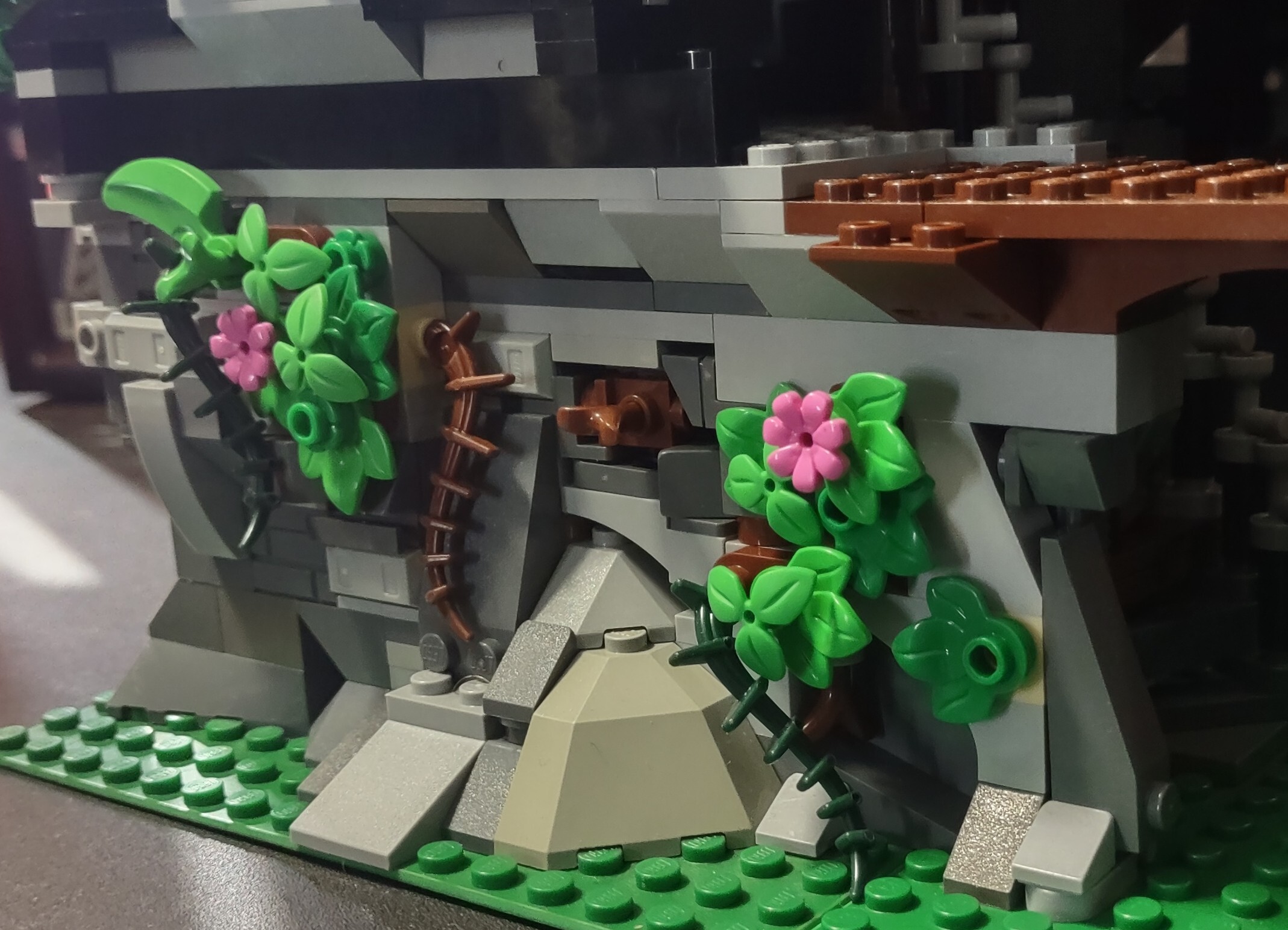
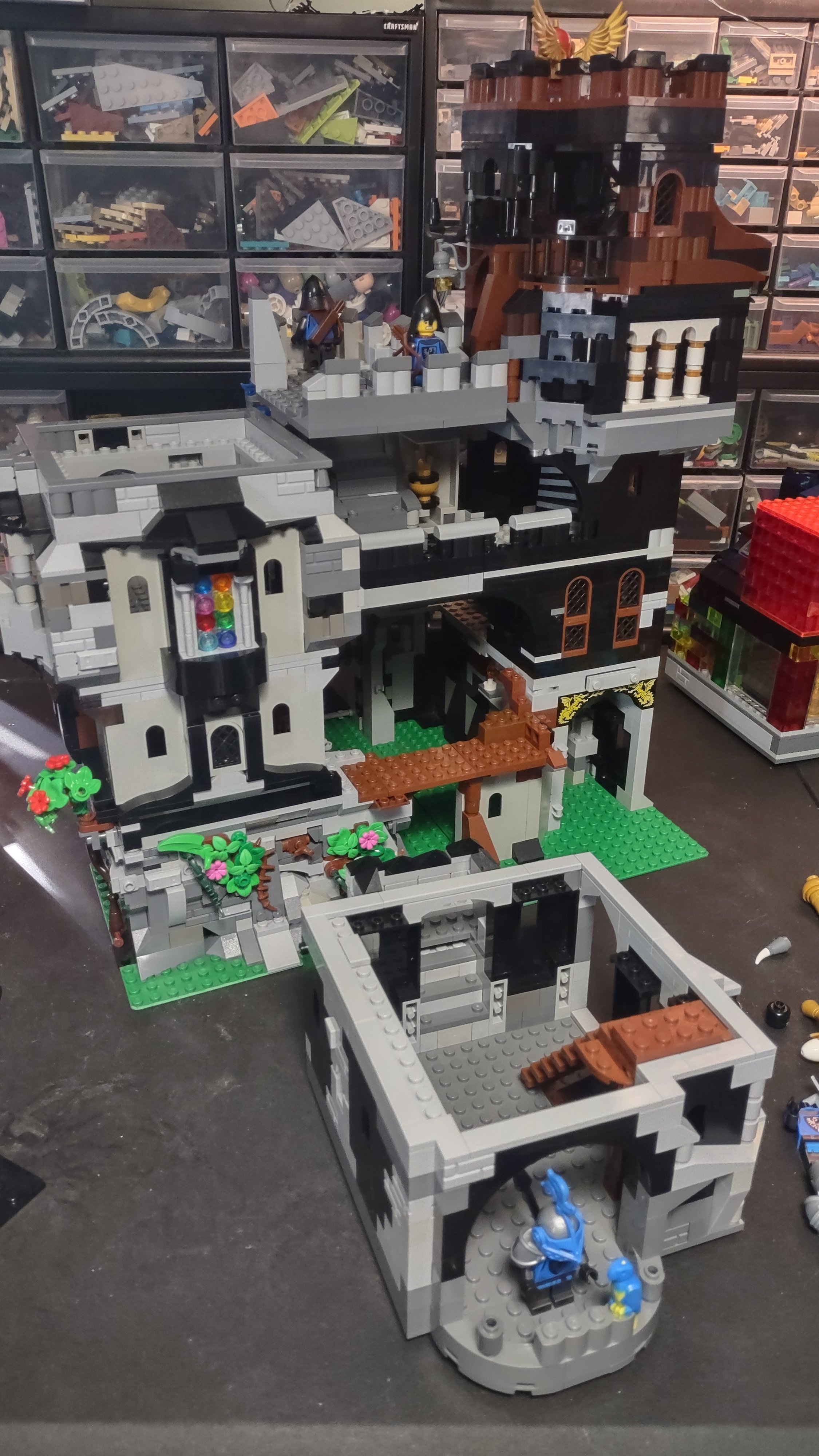
so, what are y’all working on? a few months back, I decided to build 6085, the Black Monarch’s Castle. I always loved that set, but didn’t have it when I was a kid, so I built it with the parts I have. then I modified it with some more modern touches, like the cheese wedge crenellation (yeah, that’s not very modern, it’s all relative). then I decided to expand. then expand more and more, to the point where it is now, with a very similar size and shape to the Ninjago city gardens.
staircases! 
elaborate brick work! 
modularity! 
A very little MOC. Just a starter for re-doing a set properly. The boat with the ElDorado Fortress has a completly wrong sailing configuration. For me, it looks worse than a car walking on legs. So I’m going to fix that with a proper standing and running rigging, and an adequate sail configuration for a boat of that type.
And after that, the Fortress is next.
very cool, would love to see how you improve upon that! definitely post pics of the process and final result, if you’d like.
have you built the set already? how was it, specifically the brick-built baseplate? any interesting techniques that stand out?
The ElDorado Fortress is one of the “BUT” sets. As in “this feature is good, but…”, so it is a mixed experience.
The very idea to revive an iconic set of the Pirate era is laudable. To build it with a built base instead of a raised baseplate is good, BUT it costs a load of bricks and thus drives the price of the set up in a region where it should not be: beyond €200. A price of €199 would have been acceptable.
What contributed to the high brick count was that the whole set was designed in a modular fashion, which is basically a good idea, BUT the design fell short here and it is only partly modular, i.e. the pieces only fit in a limited number of combination - the modularity is far from universal.
And so, the boat is a BUT thing, too. It is nice that they included a little sailing boat, BUT it is totally unrealistic in it’s design. The transom and rudder configuration is that of a motor boat, and the rigging is totally off with a square sail and a gaff sail on the same mast. This is as if they would sell car models with legs instead of wheels. OK, we can now discuss at length the amount of realism in a LEGO model, but this is so far off, it hurts.
The crane is a good idea and well-designed, BUT it lacks the reach to actually load and unload something from the boat.
The list goes on and on.
In the end, I decided to completely redo the model as a (large) MOC, non-modular this time. The island fortress will cover about 12 baseplates, and another 12 will be surrounding quays and docks. Luckily, I already have the polulation (20-30 blue-shirt soldiers and about 150-200 sailors - originally pirates, but they can be used as harmless laypersons, too) and about 50 guns. All collected for an abandoned project years ago.
Maybe I’ll document my work on the boat, maybe I’ll only provide it as a finished work. Don’t know.
I’m currently just starting this MOC build link
very cool 🤯 I don’t think I’ve built a technic set in about 25 years, just not my thing compared to the regular brick, but they’re so impressive.
the idea of disassembling that beast sounds nightmarish!
Thanks! Brick for brick I also enjoy ‘normal’ lego more, but the MOCs for technic are better imo and more reasonably priced from what I have seen.
So of you take rebuilding/MOCs into account, in my experience (and opinion) Lego technic gives a bit more bang for your buck, but the absolute enjoyment of building a set is bigger with regular Lego.
Disassembling a newer set is significantly easier than older sets, because the pins are still more flexible. I think they tend to harden as they age. So if you put on some nice music and think of it as a little bit of me-time, it’s not so bad.
Edit: fixed a couple of typos
who here only sees 1 photo? anyone see just 2? and who sees all 4?
between sync, boost, and thunder, I’m seeing way different results. on Thunder, there’s an option to “view all images” which opens a gallery. boost shows all 4 in the post correctly. sync only shows the post photo and the middle pic of the three in the body of the post. and no apparent way to edit the post at all, between the three apps!
life is fun
Voyager is showing me all four. They’re mixed in with the text in a fashion similar to how the page is displayed in a browser.
cool, I’ll check that one out, thanks! Boost seems to display them most accurately, which makes the fact that Sync doesn’t show half of the pics at all really weird, as that’s the app I used to make the post 🤔
Redesigning from scratch the MOC back to school castle set since i can’t find it anywhere for sale.

