
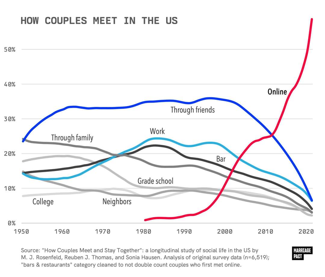
It’s been trending this way for years, but seeing it graphed out like this is shocking.
What do you think are the effects of this drastic change?
It’s been trending this way for years, but seeing it graphed out like this is shocking.
What do you think are the effects of this drastic change?
You’re still not slicing thin enough.
If 60% of the couples who got together in 2022 met on dating apps, and people who got together in 2022 constitute 5% of all couples, that’s still possible (and probable), then those couples will still only be 3% of the total. Pretty easy to add up to 11% that way when you start including all the 10-year-old relationships, the 20-year-old relationships, etc.
If it were flat at 60% for all years then no, it wouldn’t add up.
But if you look at the area under the curve, it’s still pretty small comparatively speaking because it’s such a recent phenomenon. (And not every year would actually count equally for the whole data set, but it’s displayed in this chart as every year adding up to 100% for its own year.)
Ah, right