Arctic is a (much) better Lemmy client than any other out there for iOS at least but there are some nifty features for the most recommended app Voyager like the ability to disable side swipes altogether because Apollo’s (reddit) double-tap to upvote for example is much intuitive where side swipes are used to enter and exit communities, posts, comments, menus, settings… or whole app together on Android or Jailbroken devices.
This is my multireddit link after removing u/user which were included as r/_u/redditor from an existing bug to test this for Arctic which would fully enable me along with a lot of us to leave Voyager behind.


I’m beginning to think this app is abandoned, man. I don’t expect any features to be added. TestFlight version hasn’t been updated in 2 and a half months.
It’s not dead. I’ve been very busy and have not had the time to work on it recently. I’ve started working on the next update, and I nearly have it ready for the next TestFlight release. I have a dozen or so bugs patched and a few new features done. I’m also hoping to finish up theming support before the next release.
Next month I should have the time to finish up, and release the MacOS build I’ve been working on, along with improved iPad support.
Things should start moving here again. I’m hoping to get back to weekly updates here soon.
I like the smoothness and animations from being built natively but these tiny-tiny annoyances everywhere are also irritating at the same time like with swipe gestures mentioned above that can be double-tap and long press instead or the notifications for example doesn’t reset nor receive them at real time and so on…
I keep forgetting to enable clearing notifications when reading them in app. I added this feature, but had it disabled for testing. Thank you for reminding me.
As for real-time notification, this is just not possible yet due to API limitations. If they add support for web hooks in the future, then I will add real-time notifications. But currently the only way to get notifications is to request them from the instance. Im already fetching notifications once a minute for each account with notifications enabled. This translates to a lot of network traffic for instances, and I do not want to increase that beyond what it is currently.
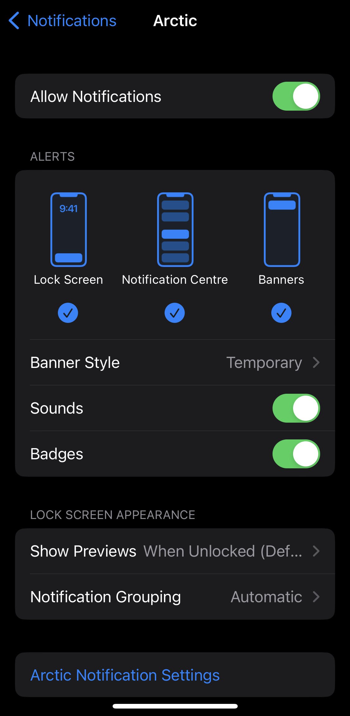
What I really meant is push notifications, like there are no banners, badges or alerts of any kind until the app is actually opened even though all permissions are granted:
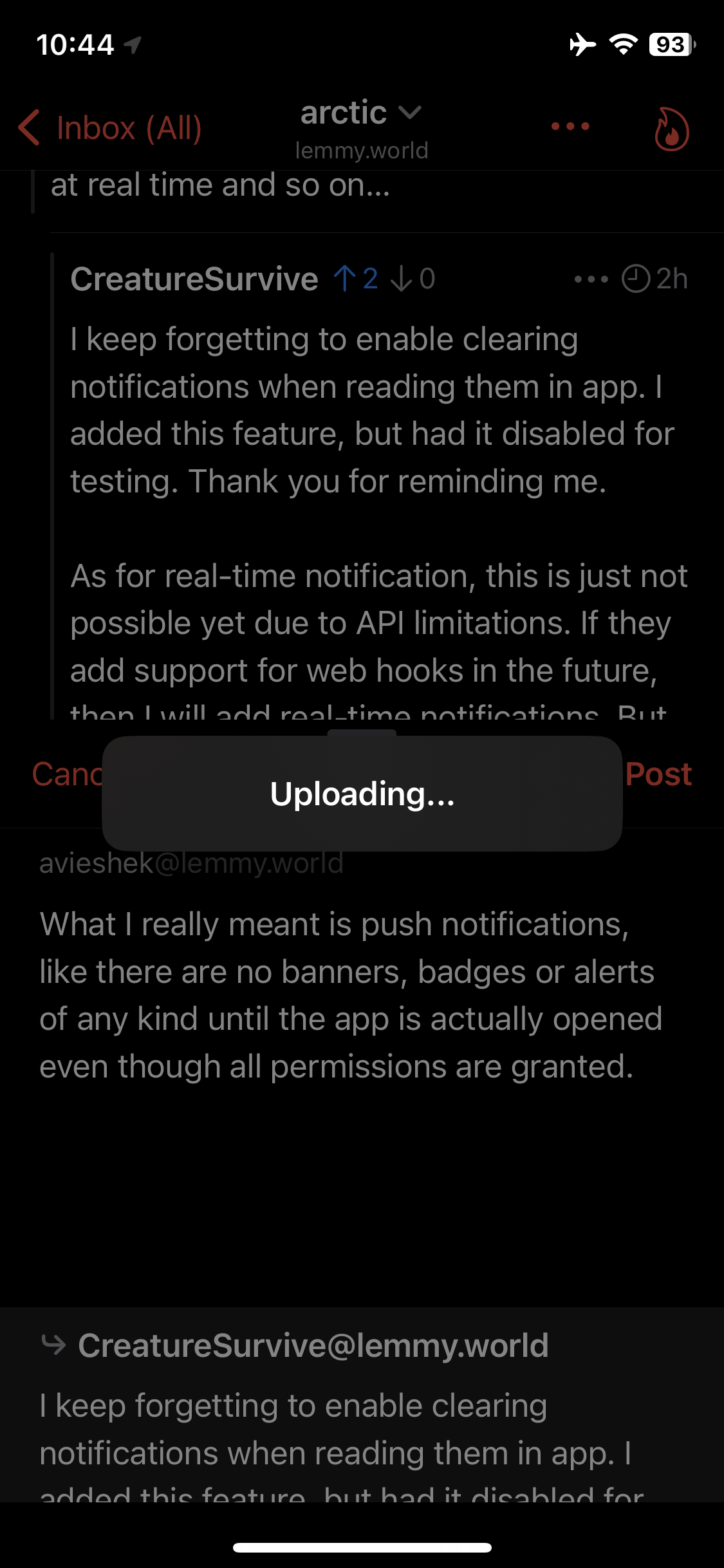
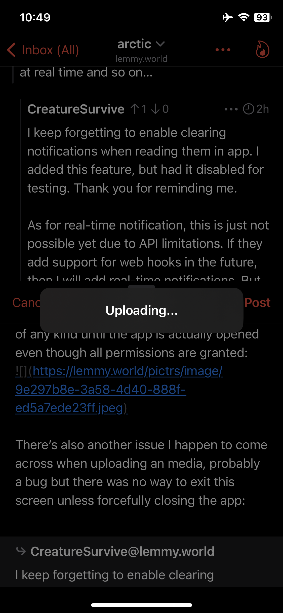
There’s also another issue I happen to come across when uploading a media, probably another bug but there was no way to exit this screen unless forcefully closing the app: Please change the interface that allows to dismiss with a cancel button so one doesn’t have to start all over again if they’re writing a comment.
Looks like this happens when permission to select more images is about to be granted but it skips to upload instead for the first time per new image:
This is a strange one, I have not received any reports of this behavior until now. I did restart the notification server today to see if that may resolve this issue, but I will be taking larger look into this during the week to see if I can’t find what might be causing this. In the meantime, could you try disabling and re-enabling the notifications in arctic to see if that resolves the issue?
I will definitely add an option to cancel media uploads, this was a poor design choice on my part, I should have included a cancel feature from the start.
You are absolutely right, this has to do with granting access to new images, I managed to resolve this for the next update. Limited access makes things a little more complicated than it should be. Now with limited access, Arctic will ask you to grant access to new photos before asking to choose new photos to upload. This can be configured in Arctics settings to ask about granting access before each upload, or only doing so once per app session.
return(enter) while pressing the shift button to introduce paragraph breaks inside the bullets and numbering just like the desktop site.Regarding Numbered List: While making a response, the numbering stays right during editing mode - something to take note of that it can be fixed as I would be looking forward to subnumbered list like 1.1 → 1.2 next, instead of just 1 → 2
Here’s reddit markdown wiki which is a good reference to bookmark for across all internet to follow in a synchronised manner.
↳ Personally, I would restrict italics to only
_italics_and bold to*bold*One thing however I don’t understand is the nature of spoiler here as opposed to anywhere else including reddit itself, the one on Lemmy is more like collapsible menu items than a spoiler. If you’re fixing the spoiler back to normal then I would request to rename the current spoiler system to something else which is good for sidebar rules but not really as a spoiler itself in comments.
>!spoiler!<::: menu Title Text :::
Looking forward to the changes. ✌︎
I would love to do this, because you are right, the spoilers in Lemmy do not function the same as spoilers on any other platform. However I can’t add this as a feature since it would only be supported in Arctic and people browsing on desktop or any other client would not would not have support for this. So until Lemmy officially supports in-line spoilers like Reddit, we will have to make do with the current system.
It doesn’t make sense to allow composing posts or comments that could only be properly viewed in Arctic.
Lemmy as well as most of the Fediverse uses the CommonMark Specification any markdown features I add will either be supported by CommonMark or by Lemmy. I do not want to create a a new specification, or use the Reddit specification unless it is adopted by Lemmy.
CommonMark does not support decimal numbers lists, so this is not an option as it would break list rendering on every other client. You have to remember that Lemmy is federated unlike Reddit. Users may be reading in a different app, on desktop, or even on a different platform like Mastodon. Changes like these need to be widely accepted and it would do more harm than good to implement breaking changes in Arctic that would not work correctly anywhere else.
Same goes for spoilers, and restricting italic markers. If these features do not meet the standard, then they will just cause harm.
As for in-line link previews. I’m not sure about this one. Most links are posted in context, like the middle of a sentence or paragraph. Putting previews in the middle like that would decrease readability. That’s partially why I treat them similar to footnotes and link them at the bottom of the context.
With that said I could add soupy for this, but it would be an optional feature that would be off by default.