
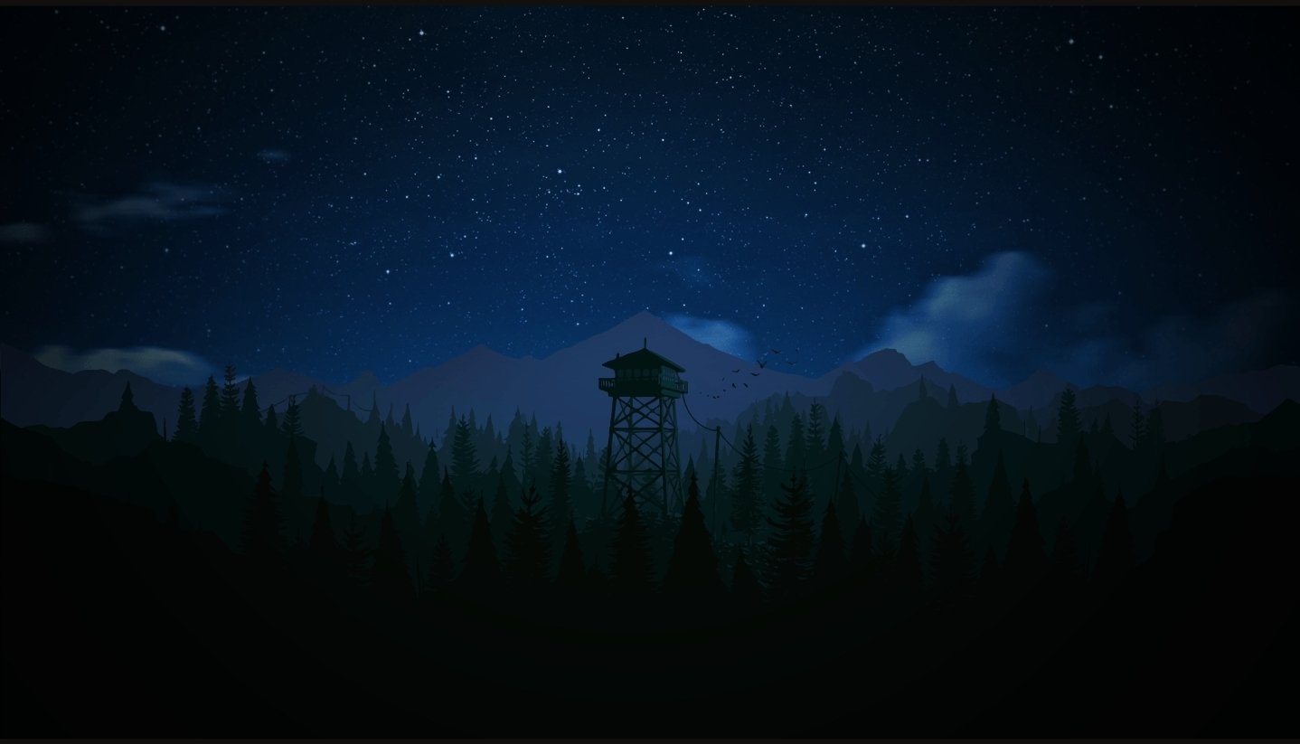
That image got really dark when I uploaded it, here’s a screenshot of it for better colors

I am a enjoyer of art but no critic. I very much like this style and I think you are well in your way. For me I actually preferred the image more when it was darker. I liked that the vibrancy was toned down and made me want to look closer and see the brush work and made me want to sit and stare and think. Great first outing.
On one hand it’s an amazing piece in both the dark and the light versions, on the other the bottom right side sort of loses something in the darker version. I feel like the minor difference adds something, even if it doesn’t draw the eye as much as the top half.
Hahaha I made my post before I saw this.
Looks much better
I feel like you may only be able to receive meaningful feedback if you mention your goals for the piece.
Honestly my only complaint is the picture is too damn dark. I fucking love this!
The op posted a lighter version in the comments, Check it out! It’s pretty great.
Cool! You missed a spot on the bottom left. Love it!
Can I ask how you did the blue and white bottom left square? I really like the effect you made with it, and I kinda wish it was more present throughout the rest of the painting, because it feels like all the drips and paint textures tend towards the bottom (which may be your intention, I wouldn’t know lmao) but it’d be kind of cool to more of that in the top half in more than just that red left-topmost rectangle. Basically what Im saying is I kind of like the texture interactions. (also after reading some of the comments here I realized the thickness of the medium shows more in the dark version than the light version, I’m guessing you painted the other shapes over a canvas you gave once over with the darker paint first?) That being said some of the color interactions are only visible in the lighter version so I can see why you posted the other one!
