I’ve been working on an alternative web UI for Lemmy for a couple weeks now and it’s got enough features I wanted to share it. I love that somehow people have found it despite me never having posted online about it until now (until a couple days ago it was called sx-lemmy, sx being an abbreviation of my username) so you might have seen it in a list already.
Alexandrite is a (for the moment) desktop-first Lemmy interface, I primarily use Lemmy on my computer and I wanted a more convenient way to view posts and comments without juggling tabs or losing my place in the feed (with infinite scrolling). It’s still very much in beta, and I have a lot of work to do still, but it’s got most of the basic features.
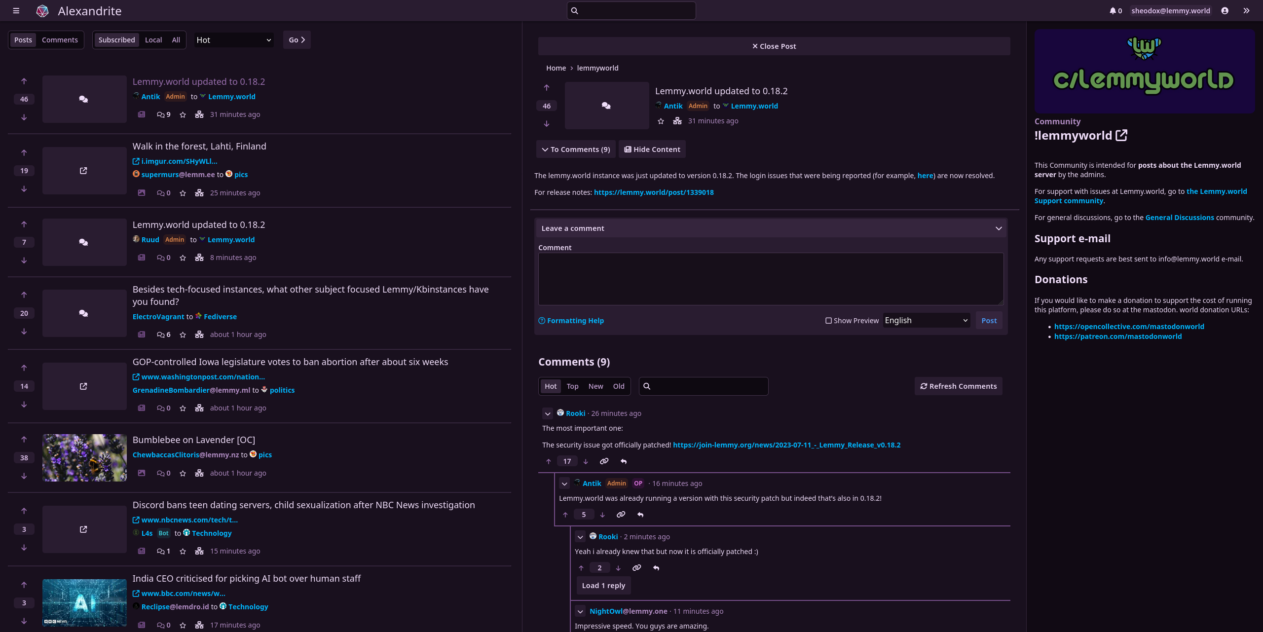
You can view a post and comments in an overlay without losing where you scrolled to:
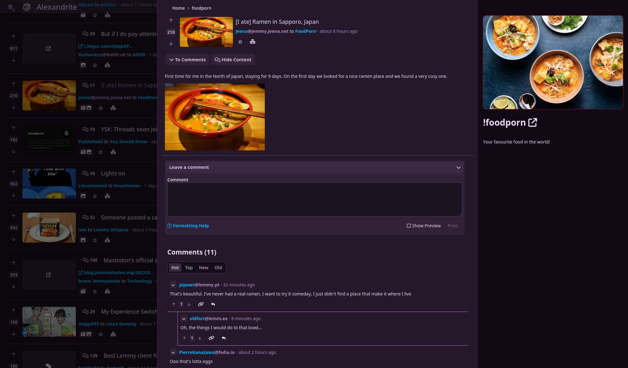
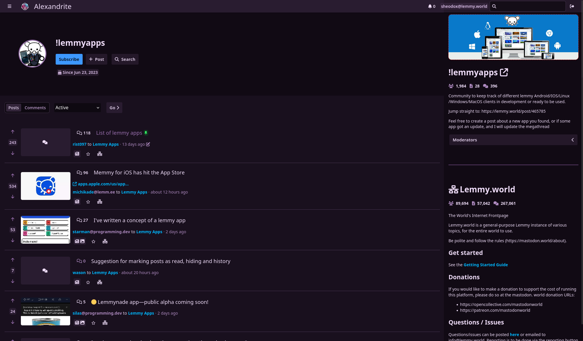
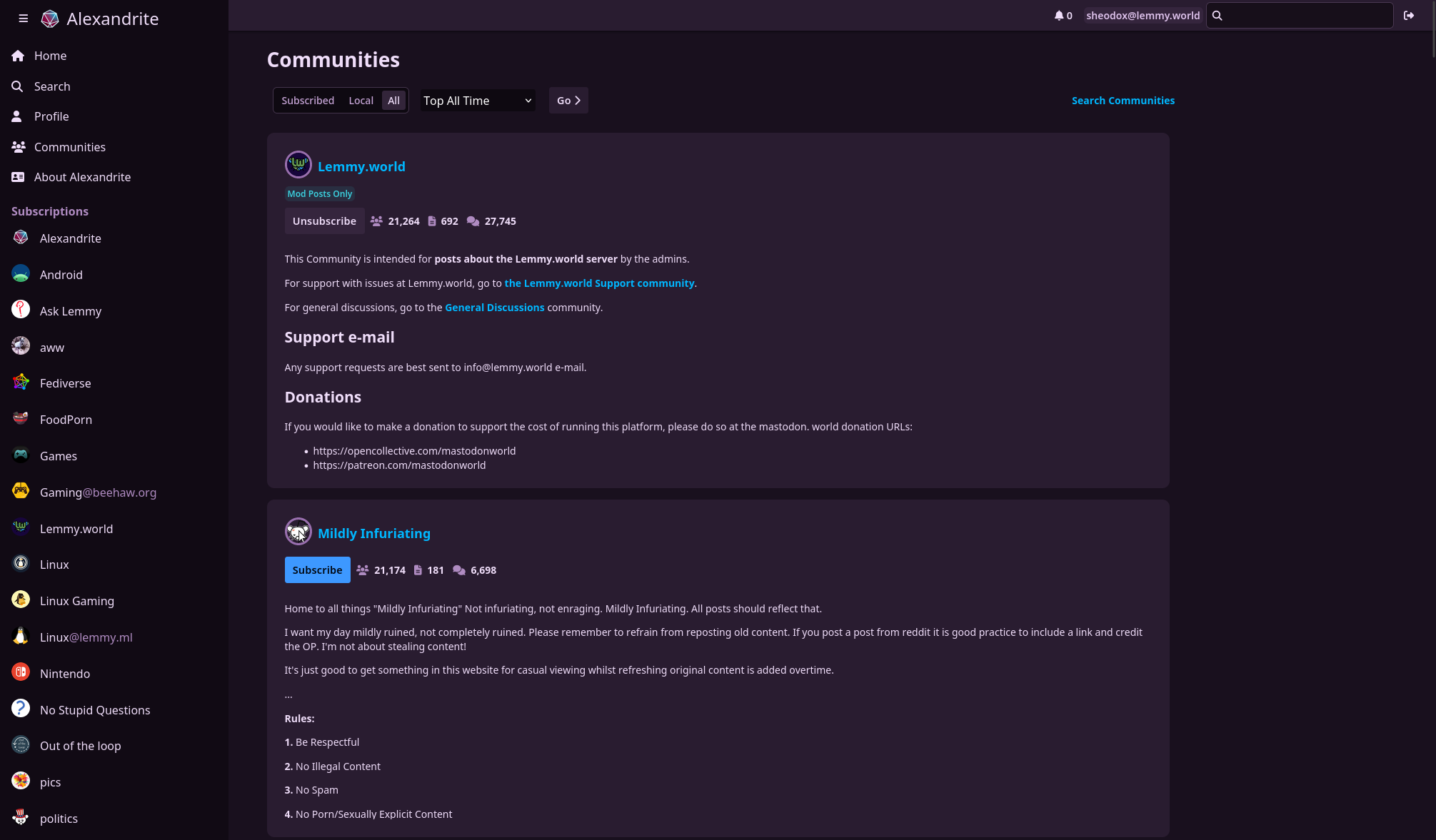
A non-exhaustive list of things you can do:
- view home/community/user/communities feeds
- post/comment
- subscribe to communities
- vote
- save posts
- search
- inbox stuff
Noteworthy missing features:
- reporting
- blocking users/communities
- mod tools
- image uploading
- automatic linkifying of urls/communities/users in comments/posts
For those who care, it’s all Sveltekit which is a dream to work with. Alexandrite is the name of the kind of gem in my wife’s wedding ring, it looks cool and changes color in the light.
Great work! Looks beautiful :)
I have two questions:
- If I login on your site, where does username/password get stored? Local Storage?
- Can I clone the repo and run it locally on my machine? If so, how? I’m not familiar with Svelte.
Thanks!
The username/password are just used once to login and get an auth token and that auth token is stored in a cookie. The username is also stored in a cookie, but the password is not. Here’s the login code
Yes you can! However the production version currently uses Sveltekit’s adapter-auto which just runs on various cloud platforms, so it might not be that easy to self host without changes. You can run the dev version of the site by cloning it, running
npm installandnpm run devand viewing it at http://localhost:5173/ but that won’t be as optimized so your page load would be slower.If you want to self host, would a docker image make it easier?
Thanks for the reply :)
Docker would be good for some people I would guess, but I’m quite happy to clone the dev site and use npm - thanks again :)
Oh, this overlay is fantastic. It reminds me of how Feedly integrates with Reddit. You’d get an overlay very similar to this where you can read the post content, article, or be funneled to Reddit to make comments. Very neat and tidy. Feedly is what I missed most about quitting Reddit. Feedly doesn’t have this sort of integration with Lemmy (yet), it just functions like a simple, but messy, RSS reader. This project makes me feel right at home and is such a quick and clean way to interact with Lemmy. Being able to post comments right in the overlay itself is even better than the Feedly/Reddit combo, too. Oh, and also the style for how comments are threaded is highly readable, it takes zero effort to understand or collapse comment chains.
I’ve mostly favored kbin (with a userscript) because I found it much easier to read and interact with than Lemmy, but your project is even better still.
Thanks for the high praise!! The idea for the overlay was the main motivation for making this site actually!
Don’t worry I am crawling Github for potential new Lemmy apps, so your project was added a while ago.
Nice story behind the name, and great work with the app!
That’s what I figured, I was just really surprised to see someone made an app with the same name as me, and then realized it was me.
I love having alternative desktop-first interfaces! Really appreciate you putting the time in to make this.
A couple hopefully constructive thoughts:
I find the text a little bit hard to read. It’s like the text is lightly purple on top of being on a purple background. Maybe one gets used to this over time.
Why the decision to not show profile pictures and community icons without hovering over them? It makes it much easier for me to identify what community content is coming from at a glance when those are present.There are now images next to users/communities on posts, let me know what you think.
Great improvement in my opinion, thanks for the quick turnaround!
deleted by creator
deleted by creator
Thanks!
Which text are you referring to? The normal text color is very slightly tinted purple but still has a pretty solid contrast ratio. Or are you talking about the text color on posts you’ve viewed already? I know certain kinds of screens don’t render color very accurately, maybe I’ll have to try it out on some other monitors around the house.
I thought having images big enough to recognize looked messy to me the way it’s done on the official Lemmy UI (at least on 0.17.4) and I hadn’t really tried making it look good. I know what you mean though, I might try showing the images (but at about the same height as the text) and see how that looks.
Well done! Looks great for me and it is a nice alternative to the “classic” look! I am already really happy with it, you did a great job! Others have already mentioned some features they would like, so I got nothing to add on that front except maybe a few customization options like color themes or compact/big picture mode. But maybe it exists and I haven’t found it yet. Anyway, really great job and it is fun to use lemmy with this!
Thanks! There aren’t really any settings yet, but I would like to add different post views for the feed someday among other things.
The theme stuff is probably somewhat easy to add. All the purple tinted colors you see (borders/texts/background colors etc) are based on a customizable hue so I can change the whole hue of the website with one css variable. I’ll throw that on my todo list.
Thank you mate! Keep up the fantastic work and the great communication here :)
I like the look a lot, but (and maybe I’m just missing it) is there a way to close the sidebar on the right? It takes up a lot of screen real estate.
Thanks! No not currently, but that’s a good idea. Out of curiosity what’s the resolution on your monitor? Do you leave your browser maximized? Just wondering how much space I’ve got to work with :)
Been using it and I love it. Endless scrolling is something I needed. A few things needed options to toggle nsfw, to blur/unblur nsfw thumbnails, also general options for things like show read posts.
Glad you like it! Yes, I need to add some settings for stuff like that, it’s on my todo list!
What do you mean by “show read posts”?
Show/hide read posts. Currently opening in overlay marks it as read so if you refresh it would/not hide with the option.
Thank you for developing this! Ask someone who uses Lemmy on their tablet this could be a great fit.
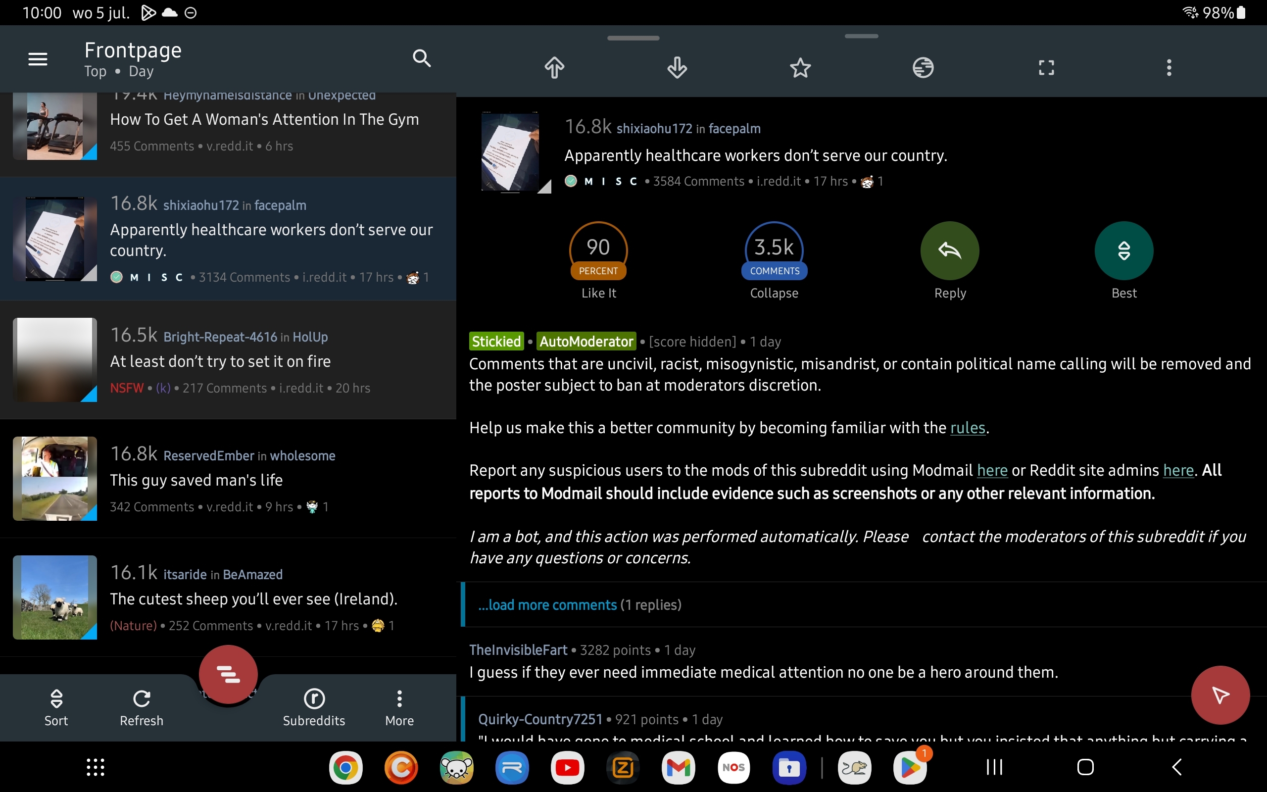
It would be awesome if the list of posts could be fixed on the left side and then the right part of the screen for the content of the selected post. The overlay is a good step in the right direction, but the link is quite small to tap correctly.
Below is a screenshot of my Reddit client, because a picture says more than a thousand words:
Thanks again!
I’ve been working on this tonight, and I’m most of the way done. Just need to do a bit more polish and hopefully it can get deployed to the main site tomorrow.
In the meantime, if you want to test it out and give me some feedback I’d appreciate it! The preview of the new version is temporarily hosted at https://column-feed-view.alexandrite.pages.dev/
Once you log in, go to the settings by clicking the User icon in the top right, you can change your feed layout in there.
Oh this would be a great idea. I’ll add it to my todo list, it’ll probably be an alternate feed layout setting someday.
Oh this looks great! I’d love to host this alongside my instance.
I already do with WefWef - https://app.thelemmy.club
Maybe something like desktop.thelemmy.club
Is all the action client side?
Thanks!
See my other comment about self hosting, as it’s probably not super easy right now.
The site uses Sveltekit and so far every interaction with Lemmy happens server side, so it’s probably not as easy to host as WefWef. I got partway through implementing image uploading yesterday until I hit a bug (fix just got merged today!) that prevented that, but image uploading is going to happen client side so it doesn’t cause extra server load.
so far every interaction… happens server side
Well that’s not ideal, both resource wise and the fact that this would cause you to run into rate limiting issues very fast
Another random reply to an old comment! I’ve got a branch out for self hosting Alexandrite if you happened to be interested in trying it out at all, more info on this post.
Ahh, I hadn’t considered the rate limiting stuff, great point. I will probably move things to the client at some point in the near future, so it’s easier for me to host too. Right now it’s using Cloudflare Pages and so far my usage today is well within the free tier limits, but hosting it as a static site elsewhere would be more easily scalable.
I’m having trouble logging in. The app says my password is incorrect but its definitely not - I logged out and then back in to lemmy.world website to double check.
I’m definitely setting the instance to lemmy.world (which is running a version above 0.18) and I’ve tried using my username and then email and I’ve cleared all browser stored data for the alexandrite.app domain - still keeps refusing my password :/
Browser is Firefox 115.0 if that makes a difference.
Hmmm, that sounds odd, I’m not having that issue on lemmy.world myself. Are there any trailing spaces in the username or password?
No, but there is at least one hyphen.
Hmm, I tried adding hyphens all over and also \n to the password on one of my accounts but never had any issues. If you have any other weird characters in your password could you try updating your password to be something more “normal” and see if that has any issues?
If you’re familiar with browser dev tools, could you check the request body in the network tab for
/instance?/setInstanceand see if your password looks correct there?Just looked - it’s all there and correct…but it has just occurred to me that my password is very long, have you got a character limit on that field?
We might be getting somewhere! I do not have any limits, but I see on the official Lemmy UI they have a 60 character limit on the password field. Is your password longer than 60 characters? It’s possible that your password was always getting cut off when logging in on lemmy.world, but now through Alexandrite it’s trying to use the full length and now it doesn’t match. Try entering only the first 60 characters of your password and try again.
I’m now replying to you from Alexandrite - so yes, that was it :)
Never got a warning from Lemmy…weird.
Woo! I’ll put the same 60 character limit on my login form then. Thanks for figuring this out with me!
It would appear the way it’s setup with the hard character limit there’s probably no good way for them to figure out if you were trying to input a longer password, since everything gets cut off at 60 regardless. Totally understandable though, not many people use that long of passwords.
I use FF 114.0.2 and have no issues
This is phenomenal.
Looks really cool.


