
Good to know. I will say as a colorblind person, it’s always a tad ironic because as a colorblind person, the filters don’t make things definitive. It’s still a bunch of random colors that I can’t identify lol
What are your biggest pet peeves as a color blind person? In software, I mean.
Those global overlay filters that tint the whole screen never seem to do anything for me at all.
On the other hand, the ones that change specific colours (enemy tags are blue instead of green, for example) are a huge help.
Partially red green colorblind here. There’s really no pet peeves, but sometimes if I must identify the color/color accent, it takes focus.
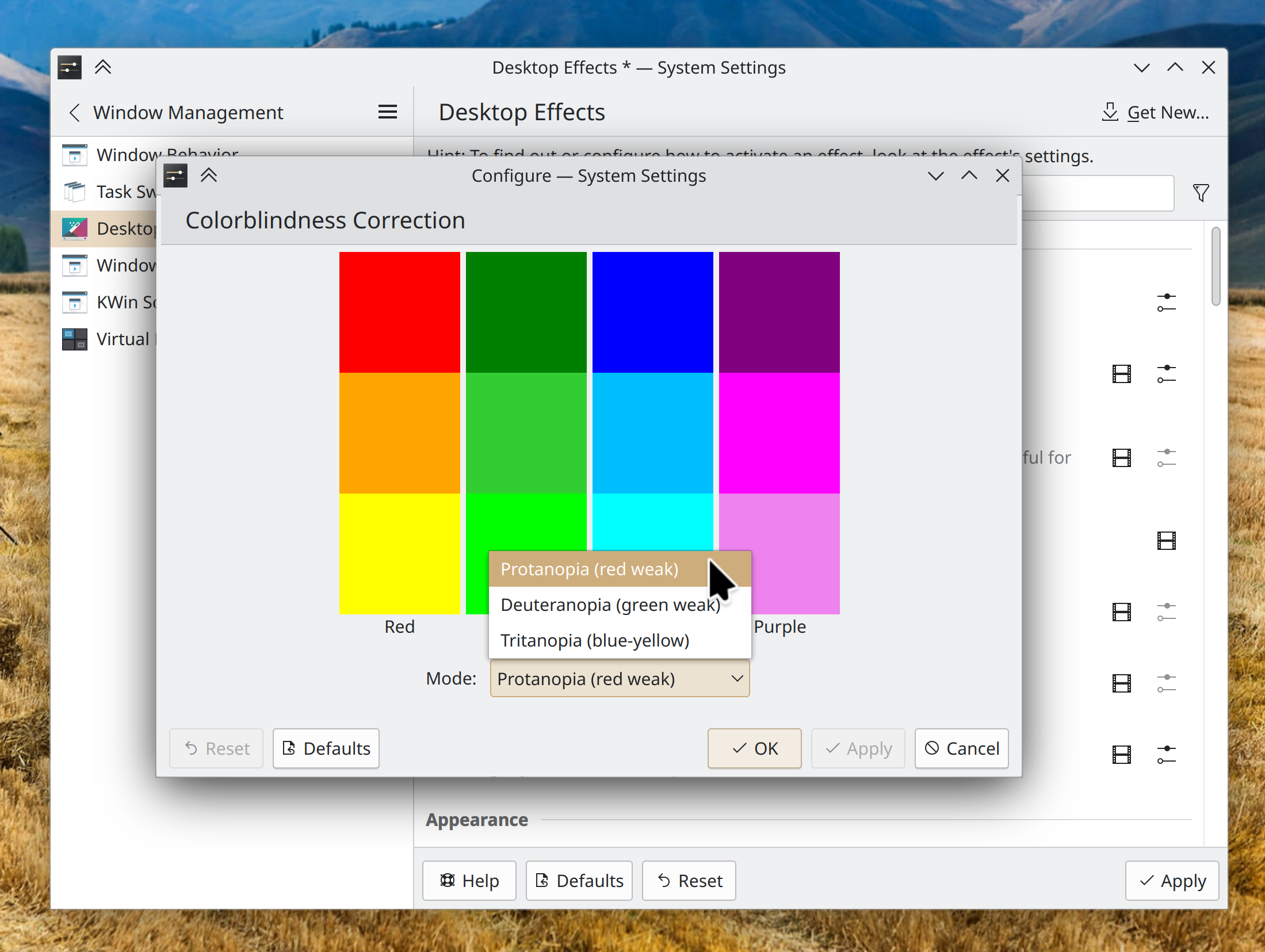
Great question. Had to think about it and I’d say for me personally, poor implementation of color pickers is the biggest frustration.
As a technical user, I have no qualms w/ editing the default selection if it’s hard to read due to colors, but I get frustrated with poor color picker implementation. For example, color swaths that don’t have named descriptions when you hover over them. Even/especially the standard ROYGBIV colors on the first page of a color picker, but also to a lesser degree, descriptive hex codes on more nuanced online color pickers. I can’t tell the difference and don’t feel like hearing someone ask why I made the bold choice of making the sky pink.
Another issue is something like KDE’s Konsole has a color picker that doesn’t have clear names/examples for which aspect of the terminal is being changed, so when I wanted to change the bash custom prompt color to improve readability, I had to edit 5-6 different options, and use trial and error to fix the color.
if this changes all colors with a global filter the way that some games like Overwatch (used to) do, then it’s really not going to help anyone. I’m red-green colorblind, so when something is highlighted in red it isn’t as obvious to me as it is to people with normal vision. However, the fix isn’t too globally mess with all the colors, the fix is to let me pick the highlight color so that I can choose what works best for me. Many games have figured this out long ago (thank you game devs!).
deleted by creator
Yeah, I mean doing that makes sense for internal testing, but why the hell would you make it public… Did this actually happen?
yep, sure did: https://old.reddit.com/r/Overwatch/comments/5uw5cs
Well, they do already have that as part of their normal theming options. There’s just software where KDE’s theming doesn’t apply, like games and webpages, and best they can do for those, is to offer such filters…
best they can do for those, is to offer such filters
well I’m sure some people will find it useful, but in my experience global filters make a global mess of everything without doing much of anything to alleviate the problem. Lucky for people like me, many games already have better options, and in other applications it usually isn’t much of a problem
Lol OW was the first thing I thought of.
Me: hey look a protan filter
OW: okay, red is now pink, and everything else is washed out :)
Me: okay tritan it is
OW: lol have fun on your acid trip
I have the same, why wouldnt this help?
oh it would for simple graphics like graphs/charts, but it’d be worse than useless for everything else like pictures / photos / video. That’s why I mentioned Overwatch as the example, which was the most egregious offender of this. If you turned on the colorblind mode in that game back when it was first introduced, it just
chromahue shifted all colors making it look like this: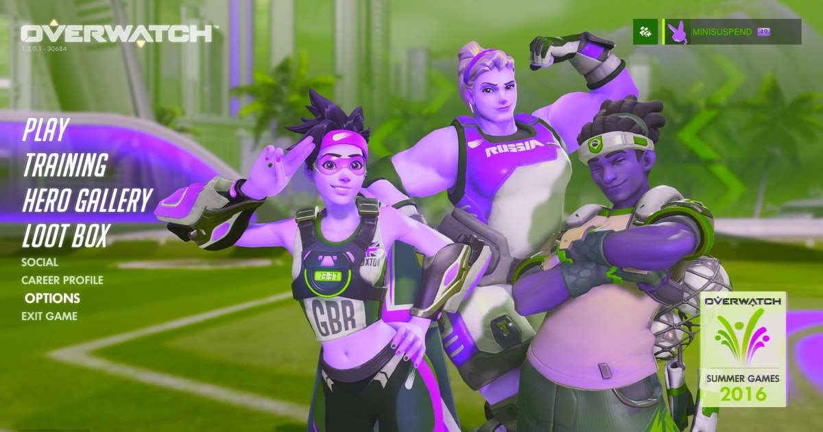
how anyone with a functioning eye and brain ever thought that was the solution is beyond me
Uhm I dont see red and green that well 😅


