Again, based on @FixedFun 's original designs so creds to them for the idea.
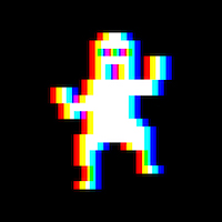
Thoughts about these ones? For the one on the right, I tried a different angle to hopefully give more bird and less bald man.
Ok. I am someone who feels like kbin doesn’t really need a mascot at this point in time. It seems really early and tbh the whole thing feels a little forced. Really not into the bird design either. I just don’t get it…
But holy shit this new icon on the right has 100% changed my mind.
It is adorable and I’d put that on the first page of my phone home screen, no questions asked.
Well done.
oh wow i didnt expect that turn around in your comment lmfao. i am so happy you guys like it, i just whipped it up expecting it to fail and was like hmm not so bad, let me send it out into the world and see. its great to see positive reactions :D
Ikr? Nice short rollercoaster 😂
And now we have a name for the mascot. It’s the Early Bird.
You had me in the first half, not gonna lie.
But why would you lie
Nice plot twist!
This is all open source so let talent do talent and let community decide.
Good “propaganda” is a must tho in digital economy and community sourced and voted product is the way to go IMHO
Lol this is exactly why I held my tongue for the first few of these posts. My first reaction was a pretty strong NO but I thought, let’s let this evolve organically and see what happens. Boy was my initial reaction wrong.
Really love this little guy!
@Kill_joy Agreed 100%
It can’t be done, but I would be tickled pink if the left image was the default icon and the right image was the icon if I have notifications waiting for me. 🤣
This is 100% doable, but probably not worth the effort.
As an iOS app icon?
As an icon on the website definitely yes, and since it’s open source, maybe somebody will disagree with you.I don’t know anything about iOS development. I know it’s possible to add pills to an icon if you have notifications, but I have no idea if iOS gives you the ability to change what the icon looks like. Because we’d be talking about a PWA, the tools may also be a little different.
As for browsers, I actually misremembered how favicons worked. After refreshing my memory, This is actually much less effort than I originally expected. Assuming an instance wanted to implement this, they could just change the
linkthat defines the icon based on the currently logged in user’s number of notifications.
I thought mine had a good shot at being a mascot, but yours is amazing and so cute!
I’m getting real, “It looks like you are searching the fediverse, would you like some help?” vibes from this. Love it!
Klippy?
I find this guy very relatable tbh
This wins. I didn’t realize how much I needed googly eyes on digital art, vs just physical things.
So simple, yet I love it so much. Well done.
I must be in the minority here, I think the one on the left looks much cuter.
Seconded
They are both extremely cute and I want both of them, somehow. I want a whole flock of the li’l screaming friends.
Both are good but the one on the right looks a bit more like a generic mascot, left one is more unique somehow.
I just love it, the Kbird never looked so good, I don’t care about credit I just want the Kbird to exist one way or another
Oh BTW, I almost forgot, yeah right one is best, also more original
I really like both of these a whole lot, but I have to agree with most others here - the one on the right is wonderful!
I also like the one on the right, it’s adorable!
The second one improves the original concept so much, I really like it! ☺️
thank you C:
The second one (right) is so much better than the previous ones. It loses the ‘bald guy’ look that the other ones have.
I still maintain that we don’t need a mascot, but… that one would be good if we need one.
I personally like the more roundness look of the first one, the one on the left.
Definitely the right one! Exactly what I wanted with the last poll!
im glad i could fulfill that :D
Left is cuter. I also like how the outline curves.
I really like the right one. It oozes confidence :)
thanks! bald man mostly gone I’d hope!
If we thinking birds for the icon, I suggest the glorious Australian bin chicken.
Such a majestic bird, constantly looking for food.
Bin chicken! Finally, a fitting description for my cousin Frank.
Throwing my vote to righty as well.
The left loses a little too much detail at smaller scale.
The little expression marks on righty need to go for the same reason imo.
All in all though, I like it!
@minnieo joining the Left Twix crowd, but they are both really great! I LOVE the gradient outline in these versions compared to the pure black outline in prior.
