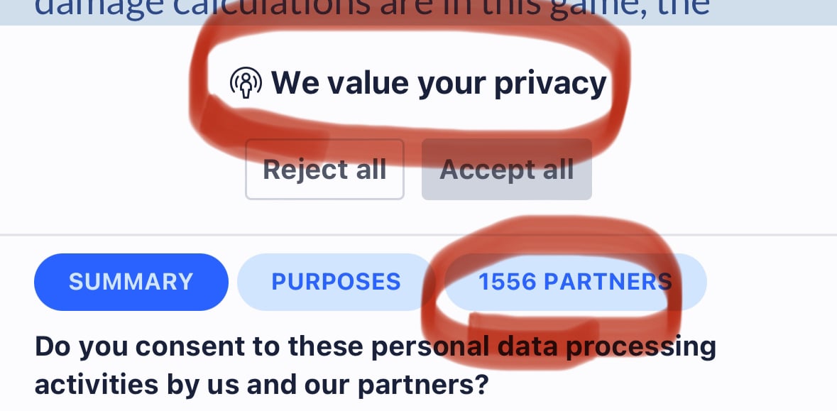
You and your 692 partners can fuck off
That’s wild! 692 “partners”, I wonder if anyone even sees the irony of that message.
HIV is a bit more real than irony
This is the highest I’ve ever seen. Also on a gaming news website.

A DNS blocker like pihole, nextdns, adguard etc might help with that.
I’d suggest uBlock Origin but then they’re running iOS.
Now that it’s owned by IGN expect it to become even worse.
I used to use aptoide for piracy many years ago. I guess that’s not a thing anymore?
I think they mean gamesindustry.biz
Fuck these MFs…
I’m very subrised ublock doesn’t solve these and cookie popups
iPhone have content blockers but those are paid applications. Mullvad (the paid VPN) has a custom DNS to filter that kind of shit (ads, trackers, gambling, social media, etc.) and it’s so effective that I can’t read Facebook or Twitter anymore. Or you have custom DNS like https://quad9.net/ but I’m not sure if they do block ads.
Not on an iPhone it cant
Cydia: Am I a joke to you
Aptoide becomes first non-Apple non-jailbreak iOS store
altstore
Aptoide becomes first non-Apple non-jailbreak non-AltStore iOS store
altstore can also be a non-apple non-altstore ios store if you live in the eu and pay them a fee, and it added that as a feature wayyy before aptoide (like you can install altstore officially without using the altstore workaround)
The AltStore: am I a joke to you?
Those apple suck ups will never know how good fdroid is .
Unless of course fdroid goes ahead and starts supporting iOS which I doubt they would .
No way.
Fdroid isn’t actually good. It sucks. What’s good is the apps you get.
Idk what your own about but I disagree and I’m pretty sure 99.99 people who uses/knows about fdroid would agree with me .
I also can make up statistics.
The concept of f droid is great. The UI and UX absolutely suck.
However it is functional, it is free and isn’t run by a limitlessly budgeted mega corp.
You can use another frontend app for F-Droid, such as Droid-ify. It has Material 3 theming.
I do agree that fdroid is ugly. Droid-ify is so much more pleasing to the eye.
The neo store also is available, can download apps from F-Droid, and it has a much better UI.
Mate, while I’m certain that they have room for improvement I’m far from calling this as much trash as you do. What’s so wrong with it?
I also can make up statistics.
I didn’t make anything up . I said I’m pretty sure 99.99 % would agree with me . Not 99.99 would agree with me .
. The UI and UX absolutely suck.
well I like the UI and UX a lot .
I can’t think of any right-minded person who thinks their UI is snappy and modern. And then the terrible app exploration features. No reviews. Half the apps don’t even have pictures. No videos. Lackluster app descriptions.
Tell me you haven’t used GPlay store and Apple AppStore in a long time without telling me.
Bruh there are no reviews cause of privacy concerns . Photos and description is the app’s devs job to provide not fdroids . I like their UI it is solid and good . Idk what you mean by apo exploration but I find it really good even tho the search feature is not the best .
Reviews are no privacy concern. You write this here and you’re not concerned for your privacy either.
Their UI is utter trash.
You clearly haven’t used other app stores recently. Else you knew what the level of expectation is these days.
yes I have recently went to play store and it was too eye candied and tries to shove shit down your throat if that is what you like good for you I don’t like that.
Thinks that are wrong and bad UI design in my opinion:
- the green and blue don’t work at all together. Generally the coloring is quiet extravagant everywhere, especially with the message “this app has been built for an older version […]”
- the spacings and margins aren’t coherent everywhere. Like in the app description where the margin to the bottom is okey but to the sides it’s much smaller and almost non-existent.
- the grid cells don’t really stand out enough. White on White with such little shadown and spacing inbetween doesn’t work.
- the animations are janky and unpolished.
- no support for Material UI 3
- buttons have too little padding inside around the icon. Buttons are generally a little too small
that’s a name I haven’t heard for a while, not since their data breach.
Aptoide sucks.
Does it? Have you tried it?
Yes, on Android. From my own investigations, it appears to have a really bad malware problem despite it’s claims of scanning for malware, especially for the free distributions of paid apps from the Google Play Store, which constitutes piracy and copyright infringement raising ethical issues.
This once again shows how the EU is toothless. making laws just for a show while allowing big tech to circumvent them while waving a big fat finger to the EU’s face.


