I kinda dig it, I’d probably look at other colors for the walls still but I think that shade of purple could definitely do some work in the right surroundings
I gotta be honest: my version looked a lot better, even with the purple hue, before I turned up the saturation and turned down the value to match OP’s picture.


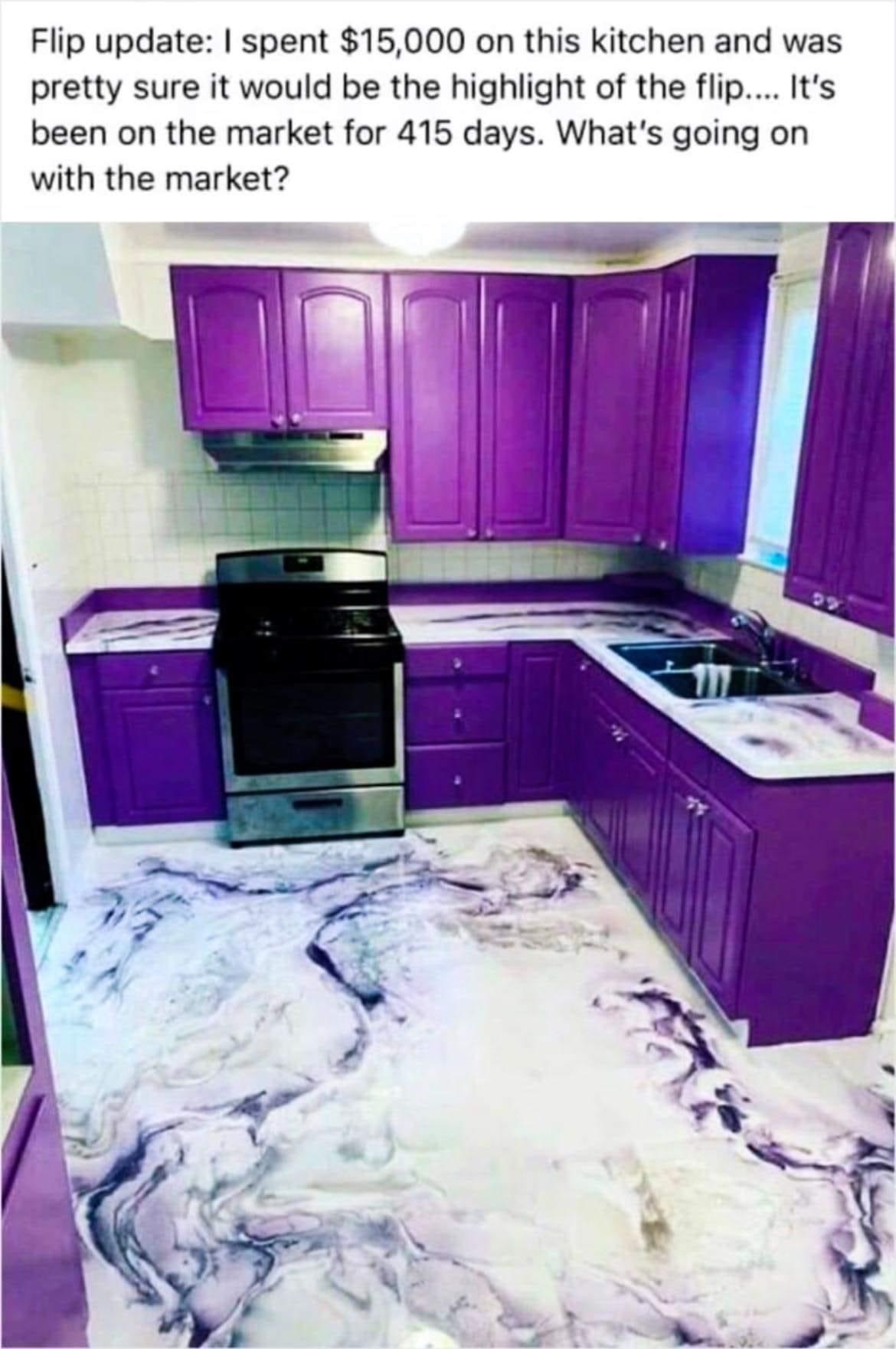
The purple cabinets could have worked if they were mid-century-modern steel cabinets or something instead of basic-bitch builder-grade wooden ones.
A quick-and-dirty Gimp hue shift of a random kitchen pic I found online to illustrate:
Maybe a different shade to clash less with the rest of the room but yeah I can see where you’re going here.
Maybe something more like an Ube shade
Like this, maybe?
(That’s the “changing hue but not saturation or value” version I alluded to in my other reply.)
I kinda dig it, I’d probably look at other colors for the walls still but I think that shade of purple could definitely do some work in the right surroundings
I 200% agree why is the colour so loud, please destroy that travesty
It’s better. But I still hate it.
I gotta be honest: my version looked a lot better, even with the purple hue, before I turned up the saturation and turned down the value to match OP’s picture.